Symbol Designer
The Symbol Designer in OctoMesh Refinery Studio allows you to create reusable graphical symbols for process diagrams and dashboards. These symbols can include dynamic properties that change appearance based on runtime data.
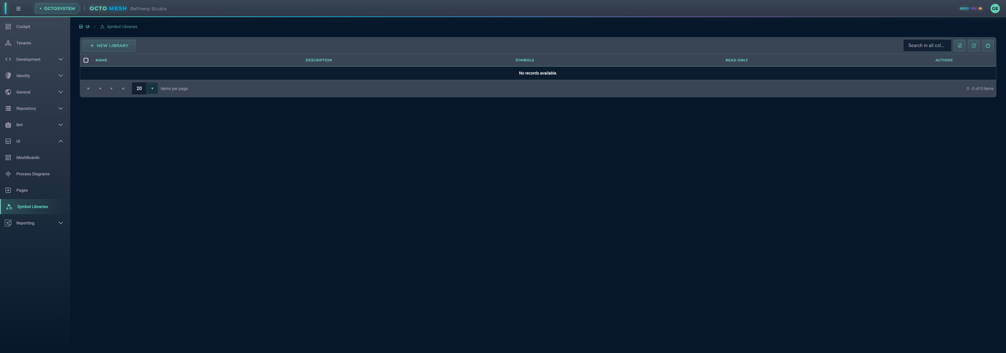
Symbol Libraries
Symbol Libraries are containers that organize your symbols. Navigate to UI > Symbol Libraries to manage your libraries.
Creating a New Library
- Click NEW LIBRARY
- Enter a name for your library
- Click CREATE
After creating a library, you can view its contents and add symbols.
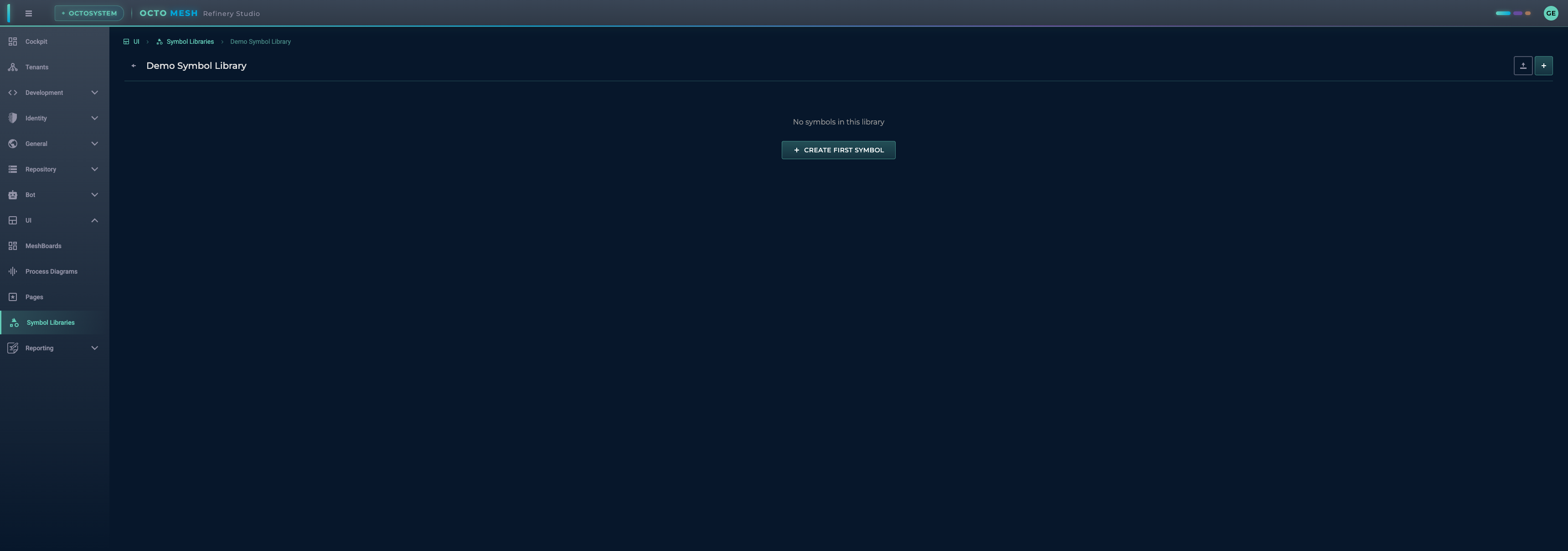
Library Actions
- Import SVG: Import existing SVG files as symbols
- New Symbol: Create a new symbol from scratch
The Symbol Designer Interface
When you create or edit a symbol, the Symbol Designer opens with a canvas area and several panels.
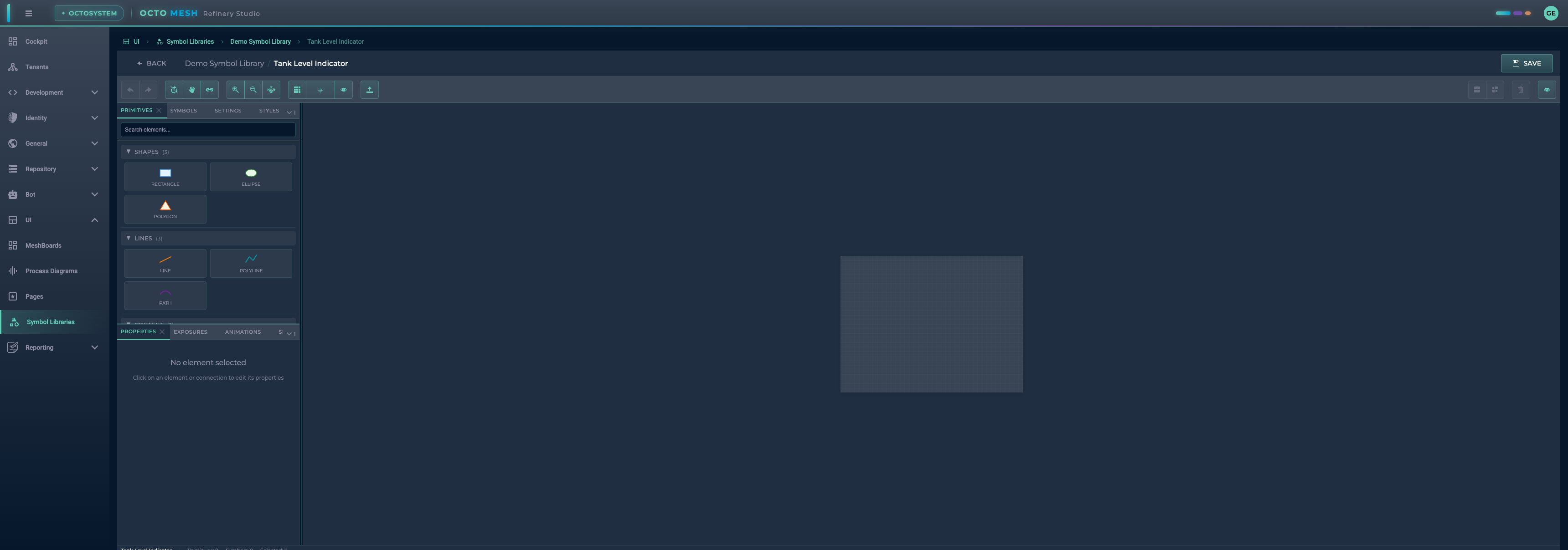
Toolbar
The toolbar at the top provides essential tools:
| Tool | Shortcut | Description |
|---|---|---|
| Undo/Redo | Ctrl+Z / Ctrl+Shift+Z | Undo or redo changes |
| Select | V | Select and move elements |
| Pan | H | Pan the canvas view |
| Connect | C | Create connections between elements |
| Zoom In/Out | - | Adjust the zoom level |
| Fit to View | - | Fit all content in the viewport |
| Show Grid | - | Toggle grid visibility |
| Snap to Grid | - | Enable/disable grid snapping |
| Show Names | - | Display element names on canvas |
| Import SVG | - | Import an SVG file |
| Group/Ungroup | Ctrl+G / Ctrl+Shift+G | Group or ungroup elements |
| Delete | Delete | Remove selected elements |
Left Panel - Element Palette
The left panel contains tabs for adding content to your symbol:
PRIMITIVES Tab
Drag and drop primitive shapes onto the canvas:
Shapes:
- Rectangle: Rectangular shapes with optional rounded corners
- Ellipse: Circles and ovals
- Polygon: Multi-sided closed shapes
Lines:
- Line: Straight lines with optional markers
- Polyline: Connected line segments
- Path: Complex SVG paths with curves
Content:
- Text: Text labels
- Image: Embedded images or SVG graphics
SYMBOLS Tab
Browse and use symbols from other libraries within your symbol (nested symbols).
SETTINGS Tab
Configure symbol metadata and canvas settings:
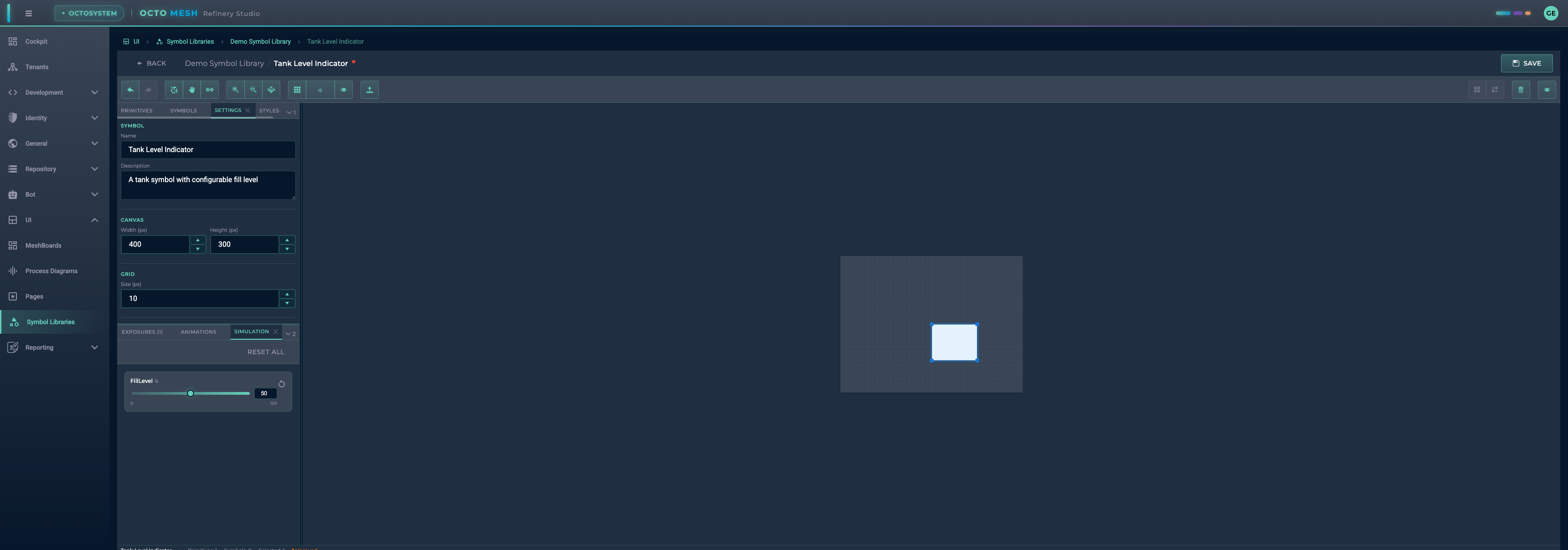
Symbol:
- Name: Display name of the symbol
- Description: Optional description
Canvas:
- Width/Height: Canvas dimensions in pixels
Grid:
- Size: Grid spacing in pixels
Metadata:
- Version: Version number (e.g., "1.0.0")
- Category: Category for organization
- Tags: Comma-separated tags for search
STYLES Tab
Define reusable style presets for your symbol elements.
Right Panel - Element Properties
The right panel shows properties for the selected element.
PROPERTIES Tab
When you select an element, the Properties tab shows its configurable options:
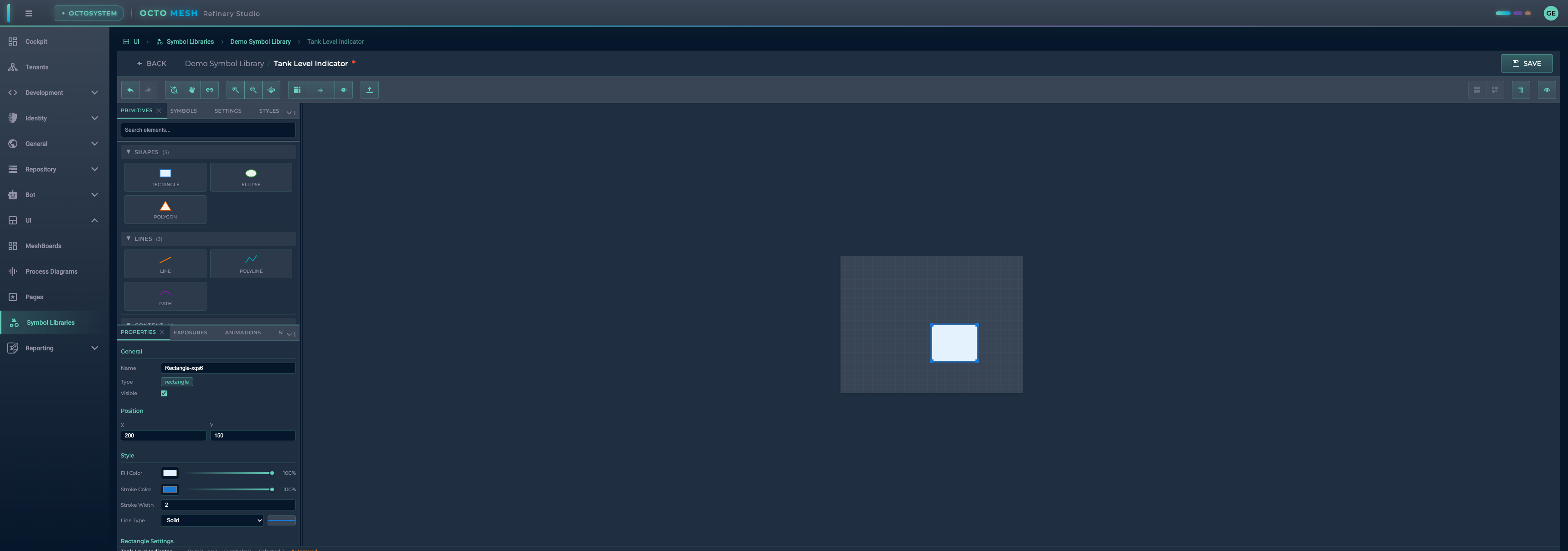
General:
- Name: Element identifier
- Type: Element type (read-only)
- Visible: Toggle visibility
Position:
- X/Y: Position on canvas
Style:
- Fill Color: Background color with opacity
- Stroke Color: Border color with opacity
- Stroke Width: Border thickness
- Line Type: Solid, Dashed, Dotted, Dash-Dot, Long Dash
Element-Specific Settings: Additional options based on element type (e.g., corner radius for rectangles).
Transform Properties (Exposures)
Transform Properties allow your symbol to change dynamically based on input values. This is how you create interactive, data-driven symbols.
Creating a Transform Property
- Click the EXPOSURES tab
- Click ADD PROPERTY
Configure the property:
| Field | Description |
|---|---|
| Name | Property identifier (e.g., "FillLevel") |
| Type | Number, Color, Boolean, or String |
| Min/Max | Value range (for numbers) |
| Step | Increment step |
| Unit | Display unit (e.g., %, °, px) |
| Default | Initial value |
| Description | Optional description |
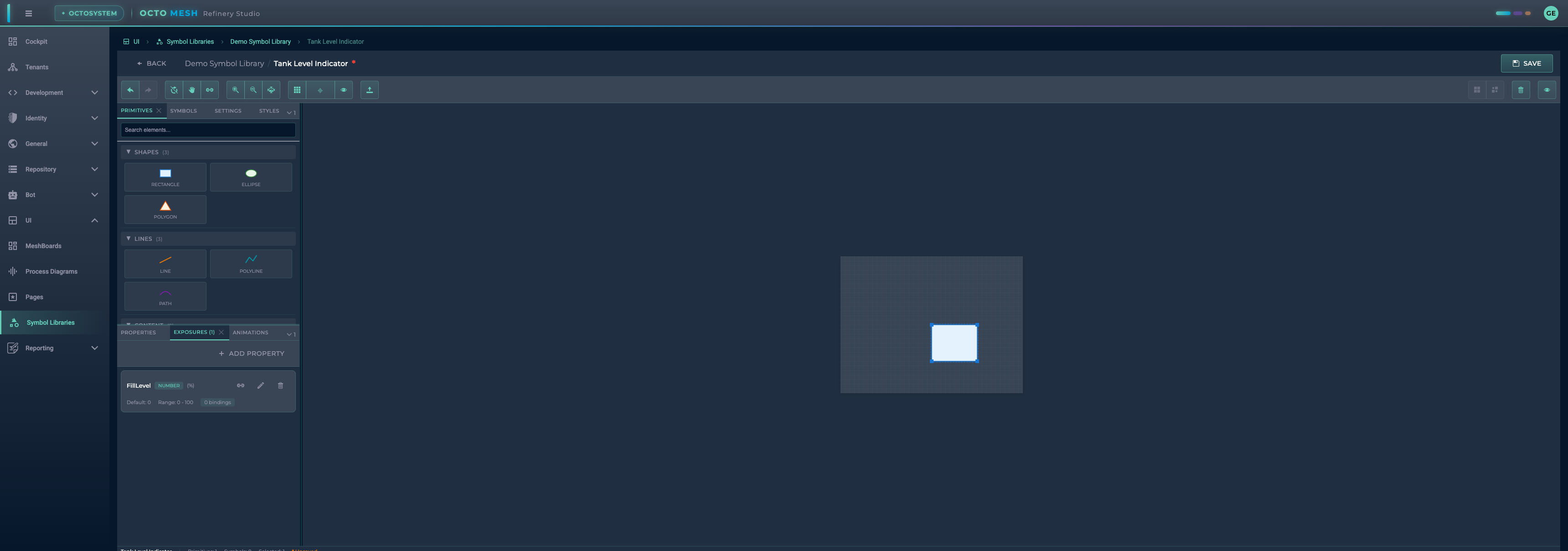
After saving, the property appears in the EXPOSURES panel:
Creating Bindings
Bindings connect a transform property to element attributes. Click Edit Bindings to configure how the property affects elements.
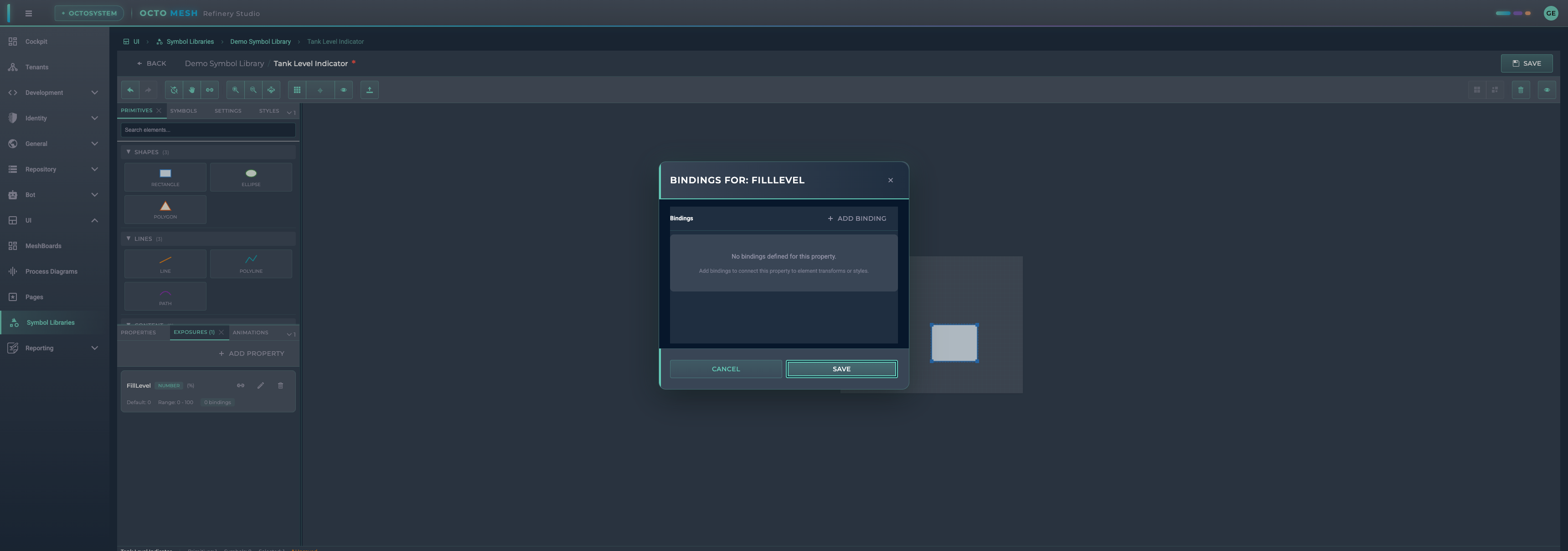
Click ADD BINDING to create a new binding:
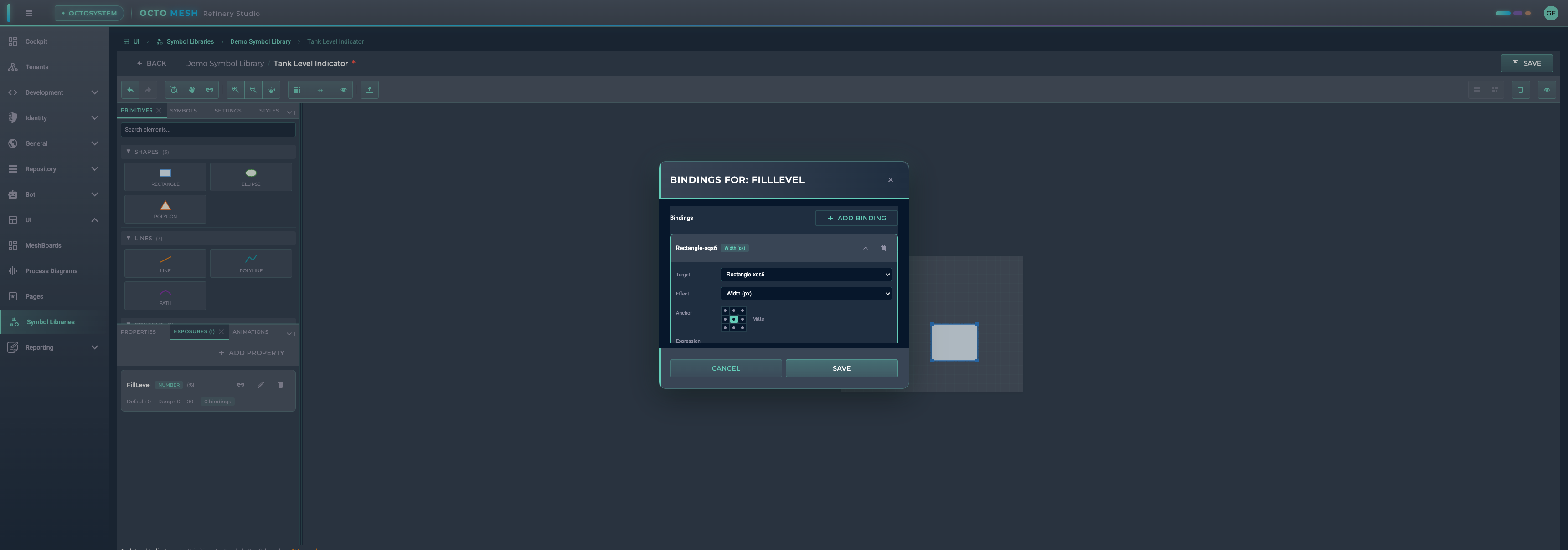
Binding Configuration:
| Field | Description |
|---|---|
| Target | Element to transform |
| Effect | What attribute to change |
| Anchor | Transformation anchor point (for some effects) |
| Expression | Formula using value as input |
Available Effects:
| Effect | Description |
|---|---|
| Width/Height (px) | Change element dimensions |
| Rotation | Rotate element (degrees) |
| Offset X/Y | Move element position |
| Scale | Uniform scaling |
| Scale X/Y | Directional scaling |
| Fill Color | Change fill color |
| Fill Opacity | Change fill transparency |
| Stroke Color | Change border color |
| Stroke Opacity | Change border transparency |
| Opacity | Overall transparency |
| Visibility | Show/hide element |
| Fill Level | Tank/bar fill visualization (0-1) |
| Pass to Child Property | Forward value to nested symbol |
| Animation Enable/Disable | Control animations |
Expression Examples:
// Pass value directly
value

// Scale 0-100 to 0-360 (for rotation)
value * 3.6

// Linear interpolation
lerp(value, 0, 100, 0, 360)

// Clamp to range
clamp(value, 0, 100)

// Color gradient based on value
lerpColor(value, 0, 100, "#00ff00", "#ff0000")
Fill Level Effect
The Fill Level effect is specially designed for tank and gauge visualizations:
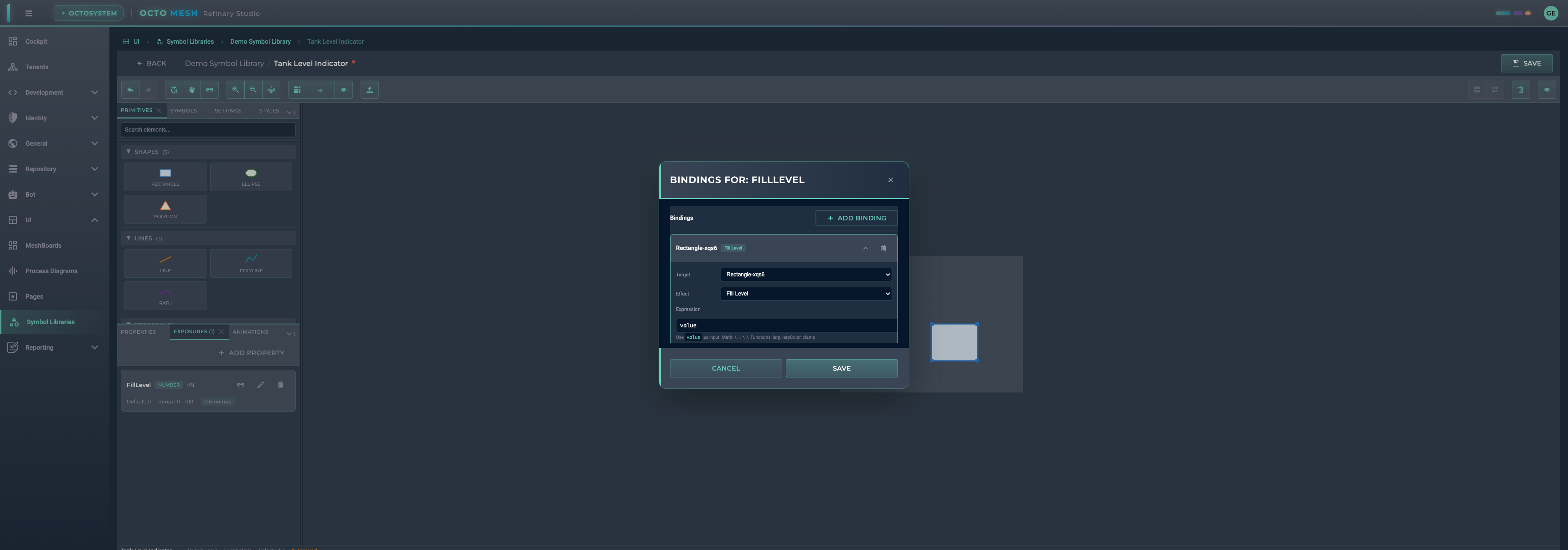
When bound to a Rectangle, it fills the shape from bottom to top based on the value (0 = empty, 1 = full).
Simulation Panel
The Simulation panel lets you test your transform properties in real-time without leaving the designer.
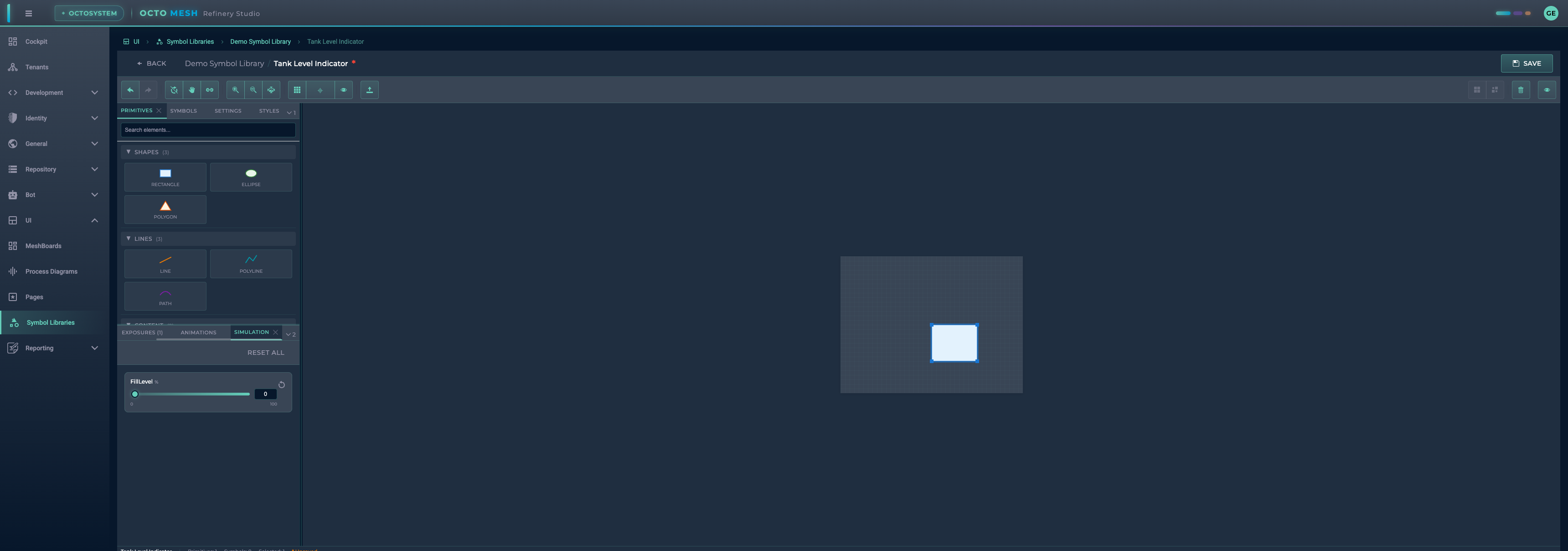
Use the slider or input field to change values and see immediate results on the canvas:

- Slider: Drag to change value
- Input: Enter exact value
- Reset to default: Restore default value
- RESET ALL: Reset all properties
Animations
The ANIMATIONS tab allows you to add SVG animations to elements:
- Attribute Animation: Animate any SVG attribute
- Transform Animation: Rotate, scale, translate
- Motion Animation: Move along a path
- Flow Particles: Particle effects along paths
Animations can be controlled by transform properties using the "Animation Enable/Disable" effect.
Keyboard Shortcuts
| Shortcut | Action |
|---|---|
| Ctrl+Z | Undo |
| Ctrl+Y / Ctrl+Shift+Z | Redo |
| Ctrl+C | Copy selected |
| Ctrl+V | Paste |
| Ctrl+D | Duplicate |
| Delete | Delete selected |
| Ctrl+G | Group selected |
| Ctrl+Shift+G | Ungroup |
| Ctrl+A | Select all |
| Escape | Deselect / Cancel |
| Arrow Keys | Move selected (1px or grid snap) |
| Shift+Arrow Keys | Move 10px |
| V | Select tool |
| H | Pan tool |
| C | Connect tool |
Saving Symbols
Click SAVE in the toolbar to save your symbol. The asterisk (*) next to the symbol name indicates unsaved changes.
Using Symbols
Once created, symbols can be:
- Used in Process Diagrams: Drag symbols from libraries onto diagram canvases
- Bound to Runtime Data: Connect transform properties to live data from OctoMesh entities
- Nested in Other Symbols: Create complex compositions by embedding symbols within symbols
Best Practices
- Use meaningful names: Name your properties and elements descriptively
- Set appropriate ranges: Configure Min/Max values that match your data
- Test with simulation: Always test your bindings before saving
- Organize with categories: Use categories and tags for easy discovery
- Document your symbols: Add descriptions to help other users understand your symbols
- Version your symbols: Update version numbers when making significant changes