MeshBoards
MeshBoards are customizable dashboards in OctoMesh Refinery Studio that allow you to visualize data from your OctoMesh entities using various widget types. They provide a flexible, grid-based layout for creating monitoring dashboards, KPI displays, and data visualizations.
Accessing MeshBoards
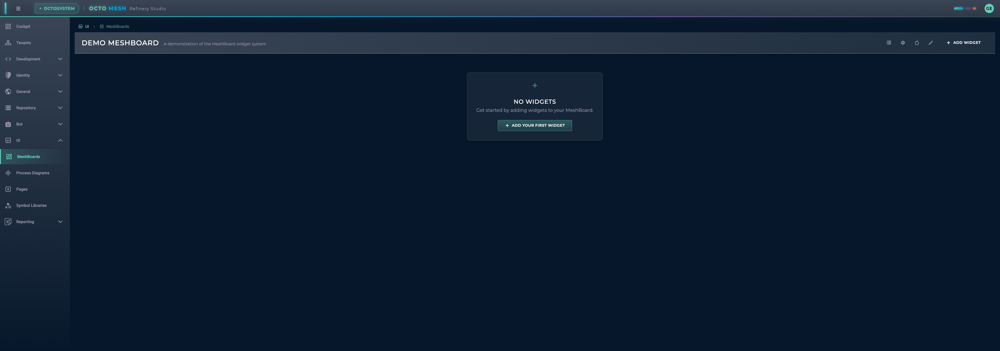
Navigate to UI > MeshBoards to access your dashboards.
MeshBoard Toolbar
The MeshBoard toolbar provides these actions:
| Button | Description |
|---|---|
| Manage MeshBoards | Open the MeshBoard management dialog |
| MeshBoard Settings | Configure the current MeshBoard |
| Refresh All Widgets | Refresh data in all widgets |
| Enter/Cancel Edit Mode | Toggle editing mode |
| ADD WIDGET | Add a new widget to the board |
| SAVE | Save changes (in edit mode) |
Managing MeshBoards
Click Manage MeshBoards to open the management dialog:
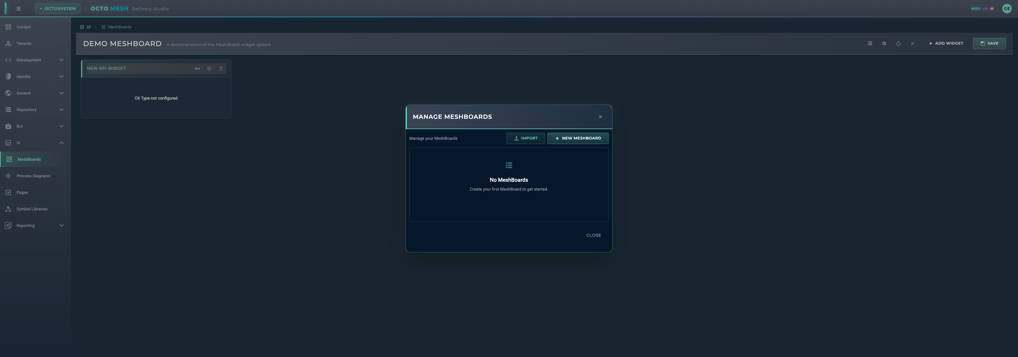
From here you can:
- IMPORT: Import a MeshBoard from a file
- NEW MESHBOARD: Create a new MeshBoard
- View and manage existing MeshBoards
MeshBoard Settings
Configure your MeshBoard by clicking MeshBoard Settings:
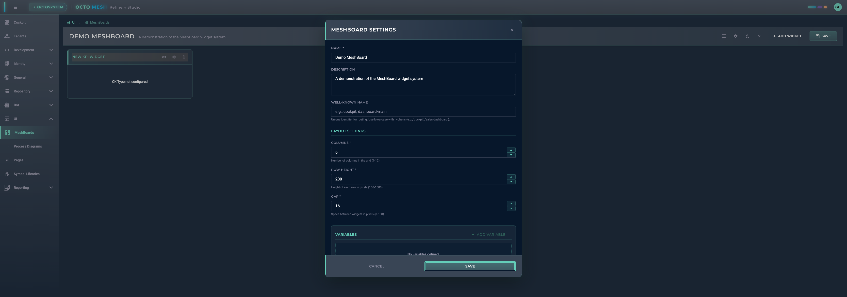
Basic Settings
| Setting | Description |
|---|---|
| Name | Display name for the MeshBoard |
| Description | Optional description |
| Well-Known Name | Unique identifier for routing (e.g., 'cockpit', 'sales-dashboard') |
Layout Settings
| Setting | Range | Description |
|---|---|---|
| Columns | 1-12 | Number of columns in the grid |
| Row Height | 100-1000 | Height of each row in pixels |
| Gap | 0-100 | Space between widgets in pixels |
Variables
Variables allow you to create dynamic, parameterized dashboards:
- Click ADD VARIABLE to create a new variable
- Define the variable name and default value
- Reference variables in widget filters as
$variableName
Example use cases:
- Filter all widgets by a selected time period
- Show data for a specific entity selected by the user
- Dynamic thresholds for KPI widgets
Time Filter
Enable the TIME FILTER option to:
- Show a time range picker in the toolbar
- Automatically set
$timeRangeFromand$timeRangeTovariables - Filter time-series data across all widgets
Adding Widgets
Click ADD WIDGET to open the widget selection dialog:
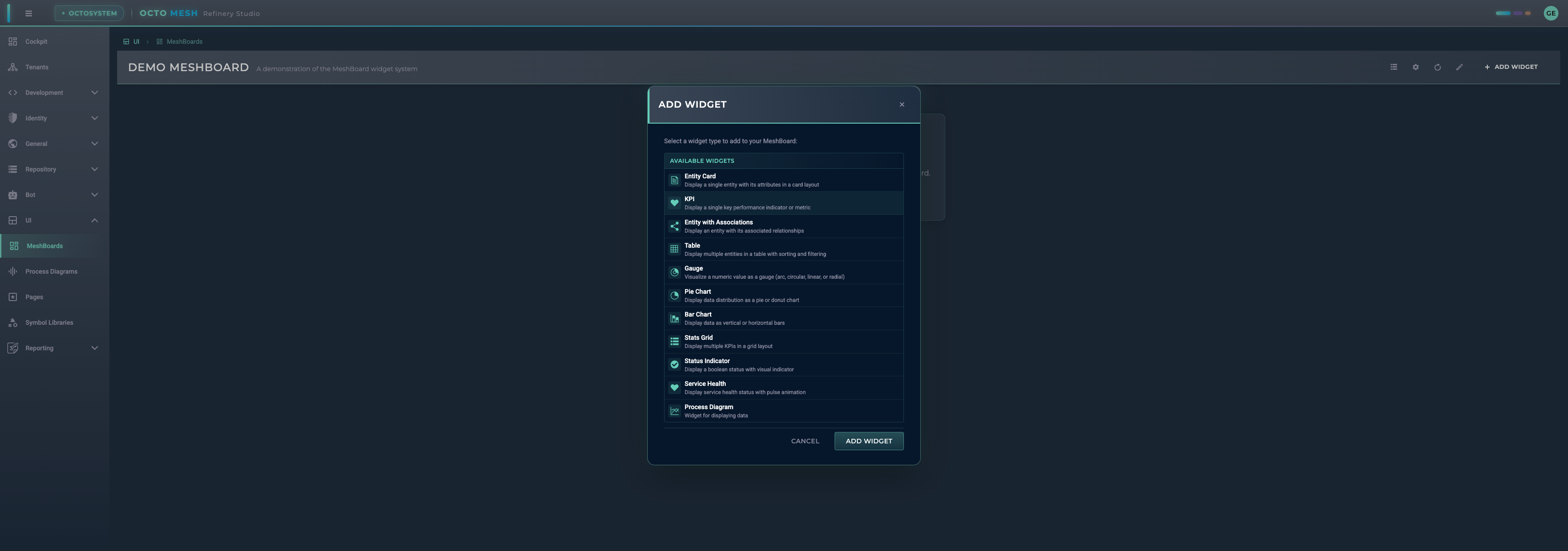
Available Widget Types
Data Display Widgets
| Widget | Description |
|---|---|
| Entity Card | Display a single entity with its attributes in a card layout |
| KPI | Display a single key performance indicator value (numeric or text) |
| Entity with Associations | Display an entity with its associated relationships |
| Table | Display multiple entities in a table with sorting and filtering |
| Stats Grid | Display multiple KPIs in a grid layout |
| Widget Group | Dynamically render multiple widgets from query results |
Visualization Widgets
| Widget | Description |
|---|---|
| Gauge | Visualize a numeric value as a gauge (arc, circular, linear, or radial) |
| Pie Chart | Display data distribution as a pie or donut chart |
| Bar Chart | Display data as vertical or horizontal bars |
Status Widgets
| Widget | Description |
|---|---|
| Status Indicator | Display a boolean status with visual indicator |
| Service Health | Display service health status with pulse animation |
Integration Widgets
| Widget | Description |
|---|---|
| Process Diagram | Embed a Process Diagram in the dashboard |
Configuring Widgets
After adding a widget, you'll see it in edit mode:
Each widget has these actions:
- Configure data source (required): Set up the data binding
- Edit position: Adjust widget size and position in the grid
- Delete widget: Remove the widget from the board
Data Source Configuration
Most widgets require a data source configuration:
- CK Type: Select the Construction Kit type to query
- Filters: Define filters to narrow down the data
- Attribute Mapping: Map entity attributes to widget properties
Position and Size
Widgets are arranged on a grid. In edit mode, you can:
- Drag widgets to reposition them
- Resize widgets by dragging their edges
- Widgets snap to the grid columns
Widget Details
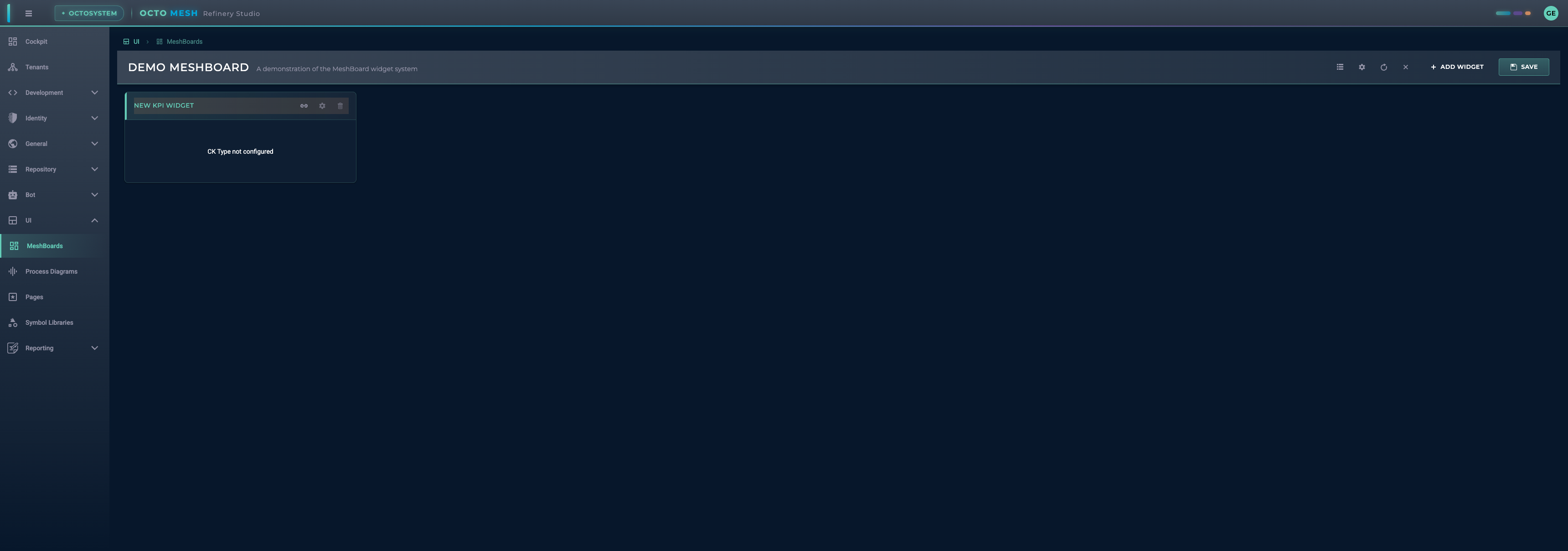
KPI Widget
Displays a single value (numeric or text) with optional formatting and trend indicators.
Value Configuration
The KPI widget can display values from different sources:
| Value Attribute | Description |
|---|---|
| Entity Attributes | Any attribute from the configured entity (e.g., temperature, status) |
| System Properties | Built-in properties available on all runtime entities |
| Query Results | Values from persistent queries (aggregation, count, grouped) |
System Properties
The following system properties are available for all runtime entities:
| Property | Description | Example |
|---|---|---|
rtId | Runtime ID of the entity | 6789A00000000000000017D7 |
ckTypeId | Construction Kit Type ID | EnergyIQ/Space |
rtWellKnownName | Well-known name of the entity | MainBuilding |
rtCreationDateTime | Creation timestamp | 2024-01-15T10:30:00Z |
rtChangedDateTime | Last modification timestamp | 2024-01-20T14:45:00Z |
System properties can be specified with or without underscore prefix: ckTypeId or _ckTypeId
Value Types
The KPI widget automatically detects and formats values:
| Value Type | Display |
|---|---|
| Numbers | Formatted with locale settings (e.g., 1.234,56) |
| Strings | Displayed as-is (e.g., EnergyIQ/Space, Active) |
| null/undefined | Displayed as - |
Configuration Options
| Option | Description |
|---|---|
| Value Attribute | The attribute or system property to display |
| Label Attribute | Optional attribute for a subtitle/label |
| Prefix | Text shown before the value (e.g., €, $) |
| Suffix | Text shown after the value (e.g., °C, %, kWh) |
| Trend | Optional trend indicator (up, down, neutral) |
Query Modes (Persistent Query Data Source)
When using a persistent query as data source:
| Mode | Description |
|---|---|
| Simple Count | Display the total count of query results |
| Aggregation | Display a single aggregated value (sum, avg, min, max) |
| Grouped Aggregation | Select a category and display its corresponding value |
Gauge Widget
Visualizes numeric values with multiple styles:
- Arc: Semi-circular gauge
- Circular: Full circle gauge
- Linear: Horizontal or vertical bar
- Radial: Radial progress indicator
Configure:
- Min/max values
- Color ranges
- Pointer style
- Scale labels
Table Widget
Displays multiple entities in a tabular format:
- Configurable columns
- Sorting and filtering
- Pagination
- Row selection
Entity Card Widget
Shows a single entity with:
- Title from entity attribute
- Configurable attribute display
- Card styling options
Chart Widgets
Pie Chart:
- Data segmentation
- Legend display
- Donut option
Bar Chart:
- Vertical or horizontal orientation
- Multiple series support
- Axis configuration
Status Widgets
Status Indicator:
- Boolean value display
- Custom colors for states
- Icon selection
Service Health:
- Health status visualization
- Pulse animation for active services
- Connection status display
Widget Group
The Widget Group dynamically creates child widgets based on query results. This is useful for displaying multiple similar widgets without manual configuration.
Use Cases
- Display KPI widgets for all machines returned by a query
- Show temperature readings for all rooms in a building
- Create status indicators for all active services
Configuration
| Option | Description |
|---|---|
| Data Source | Persistent query or CK type that returns multiple items |
| Child Widget Type | Type of widget to render for each item (KPI, Entity Card, Gauge) |
| Layout | Grid or flex layout for arranging child widgets |
| Grid Columns | Number of columns in grid layout (default: 4) |
| Value/Label Mapping | Map query result fields to widget properties |
How It Works
- The Widget Group executes a query (or loads entities by CK type)
- For each result row, it creates a child widget
- Each child widget receives data from its corresponding query row
- Child widgets support the same value types as standalone widgets (numbers, strings, system properties)
Example
A query returning 5 machines creates 5 KPI widgets, each showing the machine's status:
Query Result:           Widget Group Output:
┌──────────────────┐    ┌─────┐ ┌─────┐ ┌─────┐ ┌─────┐ ┌─────┐
│ Machine A: 95%   │ -> │ 95% │ │ 87% │ │ 92% │ │ 78% │ │ 99% │
│ Machine B: 87%   │    └─────┘ └─────┘ └─────┘ └─────┘ └─────┘
│ Machine C: 92%   │    Machine Machine Machine Machine Machine
│ Machine D: 78%   │       A       B       C       D       E
│ Machine E: 99%   │
└──────────────────┘
Edit Mode
Enter edit mode to modify your MeshBoard:
- Click Enter Edit Mode
- Add, configure, or remove widgets
- Drag widgets to reposition
- Resize widgets as needed
- Click SAVE to save changes
- Click Cancel Edit Mode to discard changes
Well-Known Names
Well-known names allow you to create MeshBoards that can be accessed via specific routes:
| Well-Known Name | Usage |
|---|---|
cockpit | Default dashboard shown on the Cockpit page |
| Custom names | Accessible via /ui/meshboards/{well-known-name} |
To set up a cockpit dashboard:
- Create a MeshBoard
- Open MeshBoard Settings
- Set Well-Known Name to
cockpit - Save the MeshBoard
Best Practices
- Plan your layout: Sketch your dashboard layout before building
- Use consistent sizing: Keep similar widgets at the same size
- Group related data: Place related widgets near each other
- Set appropriate refresh intervals: Balance data freshness with performance
- Use variables: Create reusable, parameterized dashboards
- Test with real data: Verify widgets work correctly with actual data
- Document your dashboards: Add descriptions to help users understand the purpose
Keyboard Shortcuts
| Shortcut | Action |
|---|---|
| Escape | Exit edit mode (prompts to save) |
Import/Export
MeshBoards can be:
- Exported: Download as JSON for backup or sharing
- Imported: Load from a JSON file
This enables:
- Sharing dashboards between tenants
- Version control of dashboard configurations
- Backup and restore functionality