MeshBoards
MeshBoards are customizable dashboards in OctoMesh Refinery Studio that allow you to visualize data from your OctoMesh entities using various widget types. They provide a flexible, grid-based layout for creating monitoring dashboards, KPI displays, and data visualizations.
Accessing MeshBoards
Navigate to UI > MeshBoards to access your dashboards.
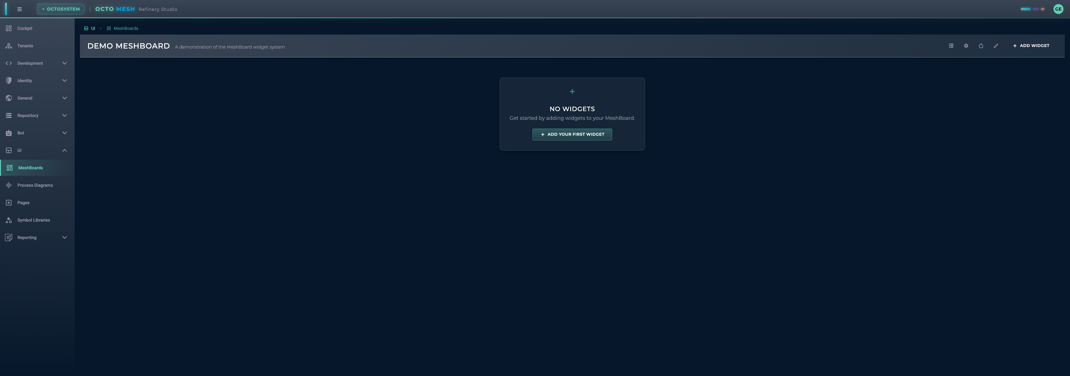
MeshBoard Toolbar
The MeshBoard toolbar provides these actions:
| Button | Description |
|---|---|
| Manage MeshBoards | Open the MeshBoard management dialog |
| MeshBoard Settings | Configure the current MeshBoard |
| Refresh All Widgets | Refresh data in all widgets |
| Enter/Cancel Edit Mode | Toggle editing mode |
| ADD WIDGET | Add a new widget to the board |
| SAVE | Save changes (in edit mode) |
Managing MeshBoards
Click Manage MeshBoards to open the management dialog:
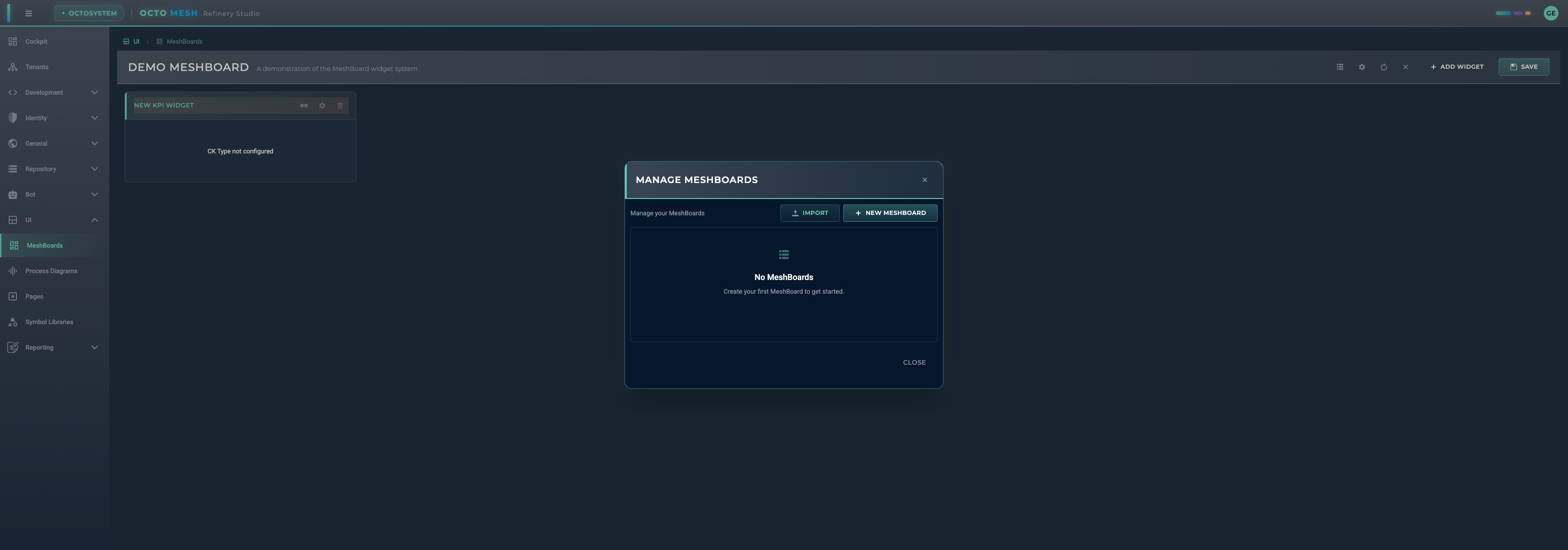
From here you can:
- IMPORT: Import a MeshBoard from a file
- NEW MESHBOARD: Create a new MeshBoard
- View and manage existing MeshBoards
MeshBoard Settings
Configure your MeshBoard by clicking MeshBoard Settings:
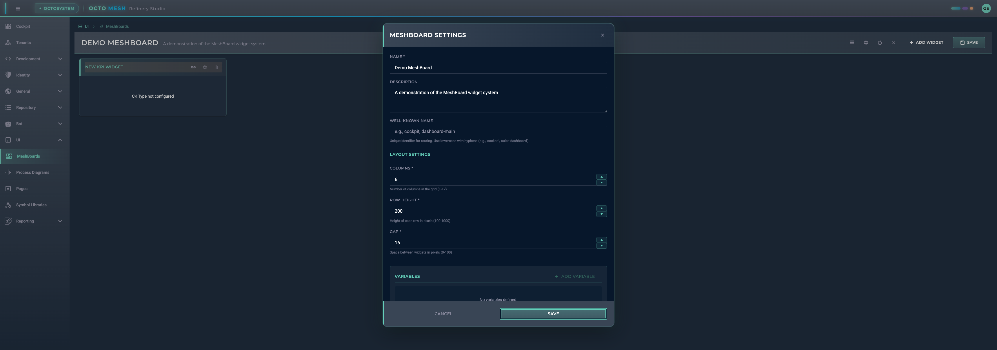
Basic Settings
| Setting | Description |
|---|---|
| Name | Display name for the MeshBoard |
| Description | Optional description |
| Well-Known Name | Unique identifier for routing (e.g., 'cockpit', 'sales-dashboard') |
Layout Settings
| Setting | Range | Description |
|---|---|---|
| Columns | 1-12 | Number of columns in the grid |
| Row Height | 100-1000 | Height of each row in pixels |
| Gap | 0-100 | Space between widgets in pixels |
Variables
Variables allow you to create dynamic, parameterized dashboards:
- Click ADD VARIABLE to create a new variable
- Define the variable name and default value
- Reference variables in widget filters as
$variableName
Example use cases:
- Filter all widgets by a selected time period
- Show data for a specific entity selected by the user
- Dynamic thresholds for KPI widgets
Timezone
The TIMEZONE option (in the Time Filter tab) sets the basis the MeshBoard uses for both the time-filter range and the way every widget displays dates and times, keeping the two consistent:
| Mode | Behaviour |
|---|---|
| Local time (browser) (default) | Ranges and timestamps use the viewer's local timezone. "Year 2026" spans the local calendar year, and a timestamp is shown in local wall-clock time. |
| UTC | Ranges and timestamps use UTC. "Year 2026" spans the UTC calendar year, and timestamps are shown in UTC. |
| Specific time zone | Pick an IANA zone (e.g. Europe/Vienna, Europe/Lisbon) from the dropdown. Ranges and timestamps use that zone's civil time — "Year 2026" spans that zone's calendar year and timestamps render in it — DST-correctly and independent of the viewer's own browser zone. This is what lets you ask "yesterday in Europe/Lisbon" from a Vienna browser and get the right answer, and to compare sites in different zones on one board. For stream data, the same zone is sent to the query so matching calendar rollups (day/week/month/year) are selected in it. |
Because the filter and the display share one basis, the boundary rows of a range read cleanly — e.g. the first row of Year 2026 shows 01.01.2026 00:00:00 in either mode. Without this alignment, a local-year filter would select rows whose UTC timestamps fall in the neighbouring calendar year (in Central Europe the local year 2026 begins at 2025-12-31T23:00:00Z), so a table column could confusingly display a 2025 value for data that belongs to 2026.
Leave this on Local time unless your audience reasons in UTC or you need a fixed civil zone (e.g. a plant's local time regardless of who is viewing). Switching mode re-evaluates the active range and refreshes all widgets immediately.
See Timezone-Aware Queries for how the chosen zone drives civil-day resolution and calendar-rollup selection on the stream-data read path.
Time Filter
Enable the TIME FILTER option to:
- Show a time range picker in the toolbar
- Automatically set
$timeRangeFromand$timeRangeTovariables - Filter time-series data across all widgets
The picker resolves ranges on the configured Timezone basis.
Adding Widgets
Click ADD WIDGET to open the widget selection dialog:
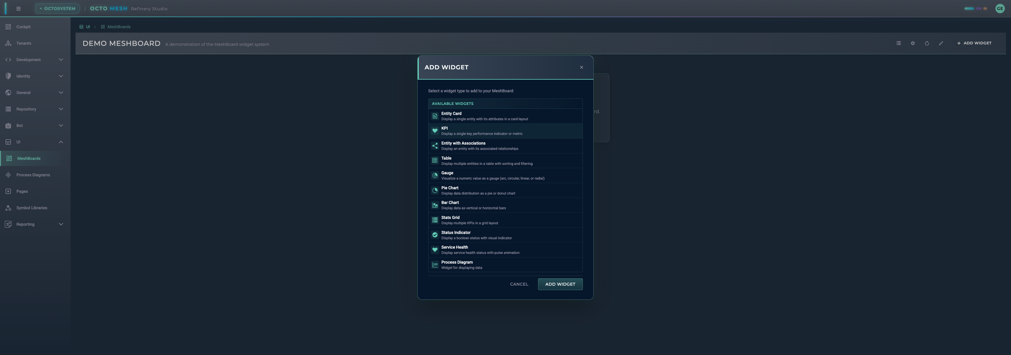
Available Widget Types
Data Display Widgets
| Widget | Description |
|---|---|
| Entity Card | Display a single entity with its attributes in a card layout |
| KPI | Display a single key performance indicator value (numeric or text) |
| Entity with Associations | Display an entity with its associated relationships |
| Table | Display multiple entities in a table with sorting and filtering |
| Stats Grid | Display multiple KPIs in a grid layout |
| Summary Card | Display a set of compact value tiles in a card |
| Widget Group | Dynamically render multiple widgets from query results |
Visualization Widgets
| Widget | Description |
|---|---|
| Gauge | Visualize a numeric value as a gauge (arc, circular, linear, or radial) |
| Line Chart | Plot one or more series over time; auto-downsamples stream data to the chart width |
| Pie Chart | Display data distribution as a pie or donut chart |
| Bar Chart | Display data as vertical or horizontal bars |
Status Widgets
| Widget | Description |
|---|---|
| Status Indicator | Display a boolean status with visual indicator |
| Service Health | Display service health status with pulse animation |
Integration Widgets
| Widget | Description |
|---|---|
| Process Diagram | Embed a Process Diagram in the dashboard; bind its exposed properties to a runtime entity or to a persistent query (runtime or stream-data) |
Configuring Widgets
After adding a widget, you'll see it in edit mode:
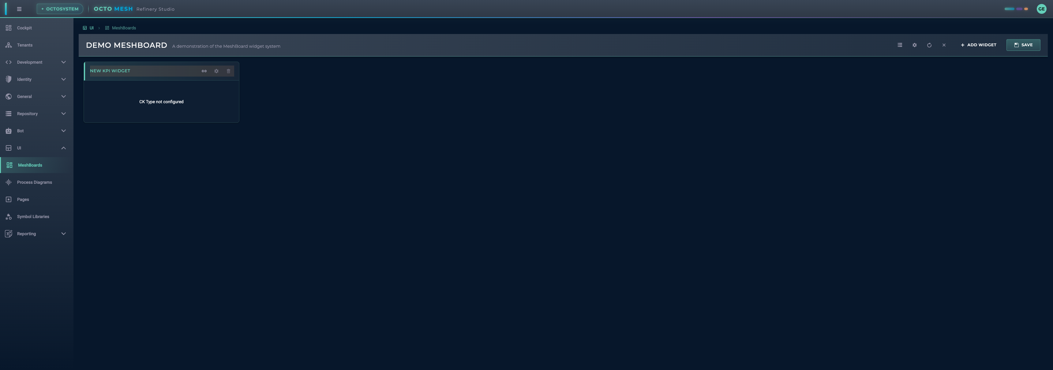
Each widget has these actions:
- Configure data source (required): Set up the data binding
- Edit position: Adjust widget size and position in the grid
- Delete widget: Remove the widget from the board
Data Source Configuration
Most widgets require a data source configuration:
- CK Type: Select the Construction Kit type to query
- Filters: Define filters to narrow down the data
- Attribute Mapping: Map entity attributes to widget properties
Position and Size
Widgets are arranged on a grid. In edit mode, you can:
- Drag widgets to reposition them
- Resize widgets by dragging their edges
- Widgets snap to the grid columns
Widget Details
KPI Widget
Displays a single value (numeric or text) with optional formatting and trend indicators.
Value Configuration
The KPI widget can display values from different sources:
| Value Attribute | Description |
|---|---|
| Entity Attributes | Any attribute from the configured entity (e.g., temperature, status) |
| System Properties | Built-in properties available on all runtime entities |
| Query Results | Values from persistent queries (aggregation, count, grouped) |
System Properties
The following system properties are available for all runtime entities:
| Property | Description | Example |
|---|---|---|
rtId | Runtime ID of the entity | 6789A00000000000000017D7 |
ckTypeId | Construction Kit Type ID | EnergyIQ/Space |
rtDisplayName | Display name of the entity, computed from the CK type's display name rules | Main Building |
rtDisplayDescription | Display description of the entity, computed from the CK type's display name rules | Headquarters, Vienna |
rtWellKnownName | Well-known name of the entity (technical identifier) | MainBuilding |
rtCreationDateTime | Creation timestamp | 2024-01-15T10:30:00Z |
rtChangedDateTime | Last modification timestamp | 2024-01-20T14:45:00Z |
System properties can be specified with or without underscore prefix: ckTypeId or _ckTypeId
Entity selectors and pickers throughout Refinery Studio label entities with rtDisplayName / rtDisplayDescription, and searching in a picker filters on rtDisplayName. rtWellKnownName is a technical identifier (e.g. for blueprint and migration targeting), not a display name.
Value Types
The KPI widget automatically detects and formats values:
| Value Type | Display |
|---|---|
| Numbers | Formatted with locale settings (e.g., 1.234,56) |
| Strings | Displayed as-is (e.g., EnergyIQ/Space, Active) |
| null/undefined | Displayed as - |
Configuration Options
| Option | Description |
|---|---|
| Value Attribute | The attribute or system property to display |
| Label Attribute | Optional attribute for a subtitle/label |
| Prefix | Text shown before the value (e.g., €, $) |
| Suffix | Text shown after the value (e.g., °C, %, kWh) |
| Trend | Optional trend indicator (up, down, neutral) |
Query Modes (Persistent Query Data Source)
When using a persistent query as data source:
| Mode | Description |
|---|---|
| Simple Count | Display the total count of query results |
| Aggregation | Display a single aggregated value (sum, avg, min, max) |
| Grouped Aggregation | Select a category and display its corresponding value |
Runtime vs. Stream-Data Queries
A persistent query data source can reference either a runtime-data query or a stream-data query (built in the Query Builder). Switching between the two is a configuration change — the same widget consumes both. The three query modes above apply to each.
When the selected query is a stream-data query, two extra options appear:
| Option | Description |
|---|---|
| Use board time filter | On by default: the MeshBoard time filter narrows the stream-data query to the picked range. Turn it off to keep the query's own intrinsic time bounds. |
| Scope to entity selector | Optionally bind the widget to an entity selector so the query is scoped to the source data of the selected asset. |
These options are hidden for runtime queries (which don't consume a time range or asset scope).
Persistent-query sources — including stream-data — are available on the KPI, Gauge, Stats Grid (per stat), Summary Card (per tile), Table, Line Chart, Bar Chart, Pie Chart and Process Diagram widgets.
Gauge Widget
Visualizes numeric values with multiple styles:
- Arc: Semi-circular gauge
- Circular: Full circle gauge
- Linear: Horizontal or vertical bar
- Radial: Radial progress indicator
Configure:
- Min/max values
- Color ranges
- Pointer style
- Scale labels
Stats Grid Widget
Displays several KPI values side by side in a compact grid. Each stat is configured independently, and each can draw its value from one of two sources:
| Source | Description |
|---|---|
| Runtime aggregation (default) | A count/sum/avg/min/max over a runtime CK type. |
| Persistent query | A saved runtime or stream-data query, reduced to a single value via the query modes. Stream-data queries expose the board time-filter and entity-selector scope options described under Runtime vs. Stream-Data Queries. |
Stats with different source types can be mixed in the same widget.
Summary Card Widget
Shows a set of compact value tiles in a single card. Like the Stats Grid, each tile is configured independently and can take its value from an entity attribute, a runtime aggregation, or a persistent query (runtime or stream-data) with the same query modes and stream-data options.
Table Widget
Displays multiple entities in a tabular format:
- Configurable columns
- Sorting and filtering
- Pagination
- Row selection
Date/time cells (including stream-data archive columns such as window_start / window_end) are rendered as dd.MM.yyyy HH:mm:ss on the board's Timezone basis.
Entity Card Widget
Shows a single entity with:
- Title from entity attribute
- Configurable attribute display
- Card styling options
Chart Widgets
Line Chart:
- One or more series plotted over time, with optional multi-axis (per unit) and reference lines
- Automatic downsampling for stream data: when the data source is a stream-data query with an active time filter, the chart asks the backend for only as many points as it can show (about one bucket per two pixels of chart width) instead of loading every raw row. It re-requests at a higher resolution when you make the widget wider.
- Min/max envelope: downsampled numeric series are drawn as an average line with a shaded band spanning the minimum and maximum of each bucket, so short spikes stay visible instead of being averaged away. The band shares the series colour and is omitted from the legend.
- A small
‹rows› rows · ‹points› ptscounter in the top-right corner shows how many rows were loaded versus how many points are plotted — handy for confirming the reduction. - Resolution badge: when the backend could not answer at the resolution the chart asked for, a badge next to that counter says why — see Chart resolution signals.
Chart resolution signals
Before it loads a stream-data series, the chart asks the backend which archive can answer the question at the requested resolution. The answer carries a signal the chart surfaces verbatim, so a thin or coarse curve is never silently mistaken for the real shape of the data:
| Signal | What the chart shows | What to do |
|---|---|---|
Ok | Nothing — the request was answered at the requested resolution. | — |
NoSuitableRollup | A badge: no rollup stores the requested aggregation (there is none, or only rollups with an incompatible function — e.g. only Avg rollups for a Sum energy series). The base archive is plotted unreduced. | Create a rollup that stores the function you are charting. |
ResolutionLimited | A badge: a matching rollup exists but even its finest rung is coarser than the requested resolution, so fewer points than requested are plotted. | Add a finer rung to the ladder, or accept the coarser curve. |
UnknownBaseGrain / EmptyLadder | A badge: the archive's native grain is not declared, or no archive was resolvable for the request at all, so the backend could not decide whether reduction was needed. | Declare the Period on the base archive, or check that the widget points at an existing, activated archive. |
CoverageLimited | A badge with a "history available from" hint naming the date the finer rung's history starts. The chart falls back to the coarser rung whose history reaches back to the start of your time filter; if no rung reaches that far, the rung whose history starts earliest is used. The whole range is plotted from that rung. | Nothing is wrong — the finer rung simply has no data that far back. Narrow the time filter to the finer rung's range for the higher resolution, or backfill the finer rung. |
CoverageLimited takes precedence over Ok and ResolutionLimited: if the chart had to step
down a rung because the finer one has no history for the requested start, that is what the badge
reports. A rung is always plotted — the one whose history reaches back to your start, or, when none
does, the rung whose history starts earliest — so the coverage check never leaves the chart empty.
Coverage is measured from the rows each archive actually holds — see Stream Data Archives — Coverage for how it is measured, cached, and queried outside the board.
Pie Chart:
- Data segmentation
- Legend display
- Donut option
Bar Chart:
- Vertical or horizontal orientation
- Multiple series support
- Axis configuration
Status Widgets
Status Indicator:
- Boolean value display
- Custom colors for states
- Icon selection
Service Health:
- Health status visualization
- Pulse animation for active services
- Connection status display
Widget Group
The Widget Group dynamically creates child widgets based on query results. This is useful for displaying multiple similar widgets without manual configuration.
Use Cases
- Display KPI widgets for all machines returned by a query
- Show temperature readings for all rooms in a building
- Create status indicators for all active services
Configuration
| Option | Description |
|---|---|
| Data Source | Persistent query or CK type that returns multiple items |
| Child Widget Type | Type of widget to render for each item (KPI, Entity Card, Gauge) |
| Layout | Grid or flex layout for arranging child widgets |
| Grid Columns | Number of columns in grid layout (default: 4) |
| Value/Label Mapping | Map query result fields to widget properties |
How It Works
- The Widget Group executes a query (or loads entities by CK type)
- For each result row, it creates a child widget
- Each child widget receives data from its corresponding query row
- Child widgets support the same value types as standalone widgets (numbers, strings, system properties)
Example
A query returning 5 machines creates 5 KPI widgets, each showing the machine's status:
Query Result:           Widget Group Output:
┌──────────────────┐    ┌─────┐ ┌─────┐ ┌─────┐ ┌─────┐ ┌─────┐
│ Machine A: 95%   │ -> │ 95% │ │ 87% │ │ 92% │ │ 78% │ │ 99% │
│ Machine B: 87%   │    └─────┘ └─────┘ └─────┘ └─────┘ └─────┘
│ Machine C: 92%   │    Machine Machine Machine Machine Machine
│ Machine D: 78%   │       A       B       C       D       E
│ Machine E: 99%   │
└──────────────────┘
Edit Mode
Enter edit mode to modify your MeshBoard:
- Click Enter Edit Mode
- Add, configure, or remove widgets
- Drag widgets to reposition
- Resize widgets as needed
- Click SAVE to save changes
- Click Cancel Edit Mode to discard changes
Well-Known Names
Well-known names allow you to create MeshBoards that can be accessed via specific routes:
| Well-Known Name | Usage |
|---|---|
cockpit | Default dashboard shown on the Cockpit page |
| Custom names | Accessible via /ui/meshboards/{well-known-name} |
To set up a cockpit dashboard:
- Create a MeshBoard
- Open MeshBoard Settings
- Set Well-Known Name to
cockpit - Save the MeshBoard
Best Practices
- Plan your layout: Sketch your dashboard layout before building
- Use consistent sizing: Keep similar widgets at the same size
- Group related data: Place related widgets near each other
- Set appropriate refresh intervals: Balance data freshness with performance
- Use variables: Create reusable, parameterized dashboards
- Test with real data: Verify widgets work correctly with actual data
- Document your dashboards: Add descriptions to help users understand the purpose
Keyboard Shortcuts
| Shortcut | Action |
|---|---|
| Escape | Exit edit mode (prompts to save) |
Import/Export
MeshBoards can be:
- Exported: Download as JSON for backup or sharing
- Imported: Load from a JSON file
This enables:
- Sharing dashboards between tenants
- Version control of dashboard configurations
- Backup and restore functionality